Business Banking
on the go
A mobile app concept for Victoriabank

38 21
navigation items
10 5
menu sections to tabs
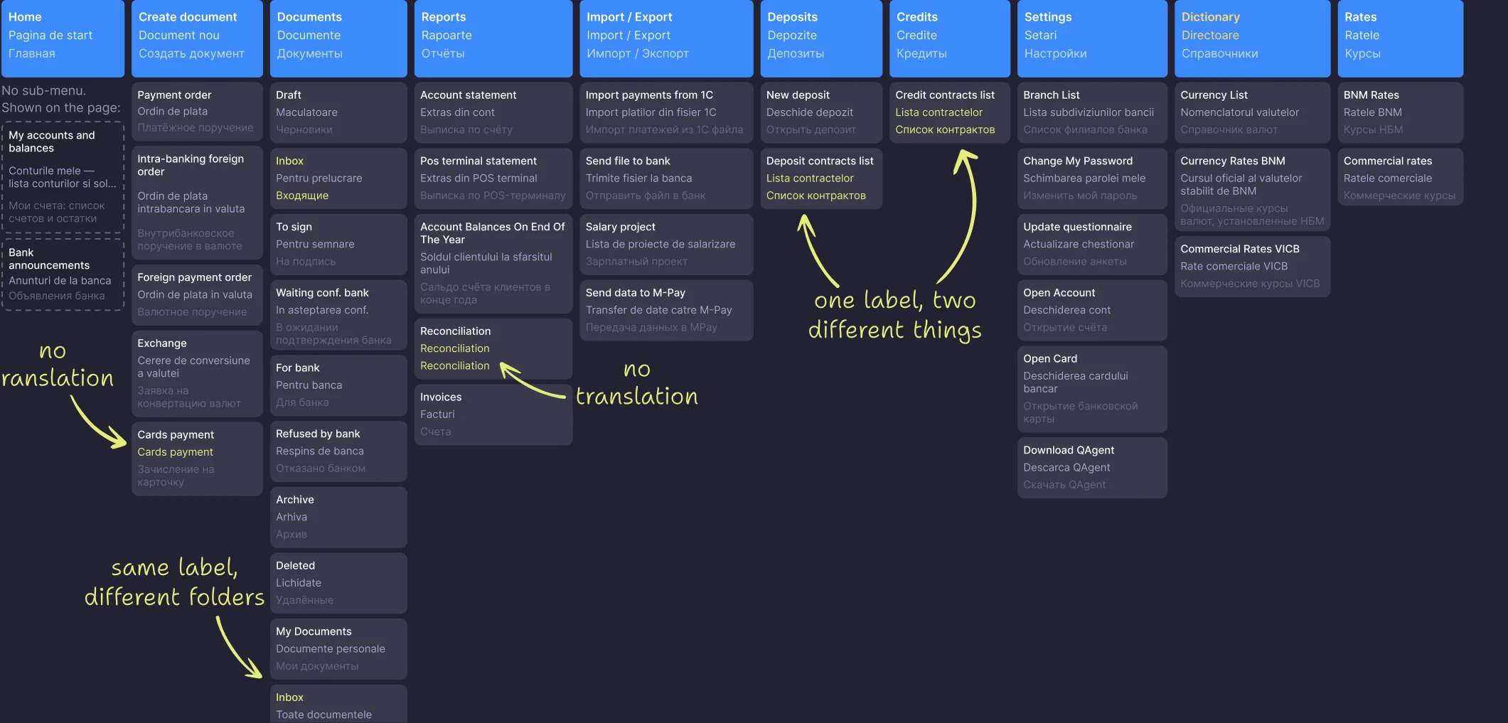
Challenge. A business owner needs from their banking four jobs on the go, and all four live only on desktop.
Benchmarks. I compared the best global and local business apps to see what VB should take.
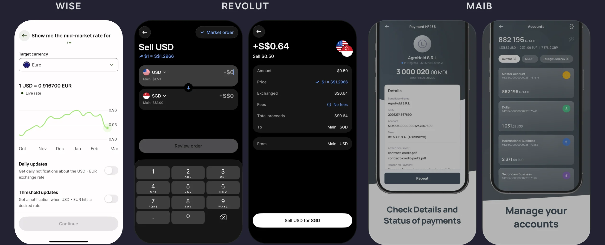
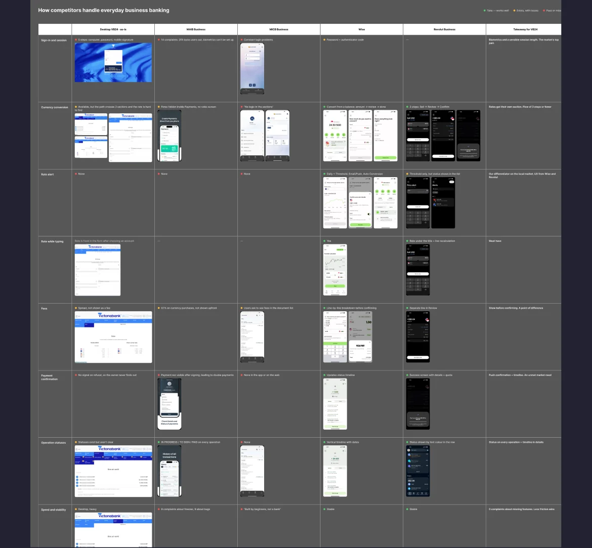
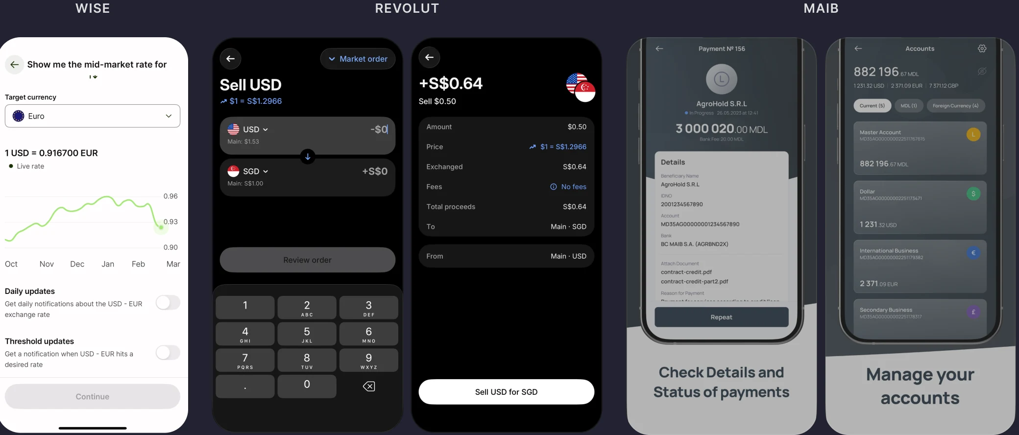
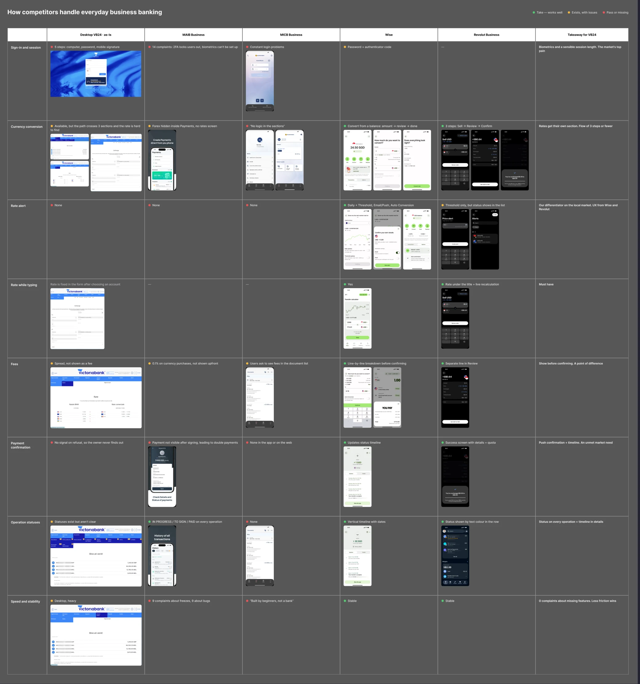
Competitor comparison
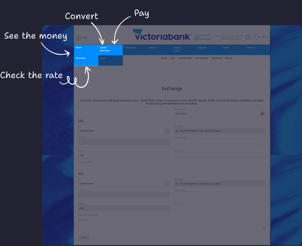
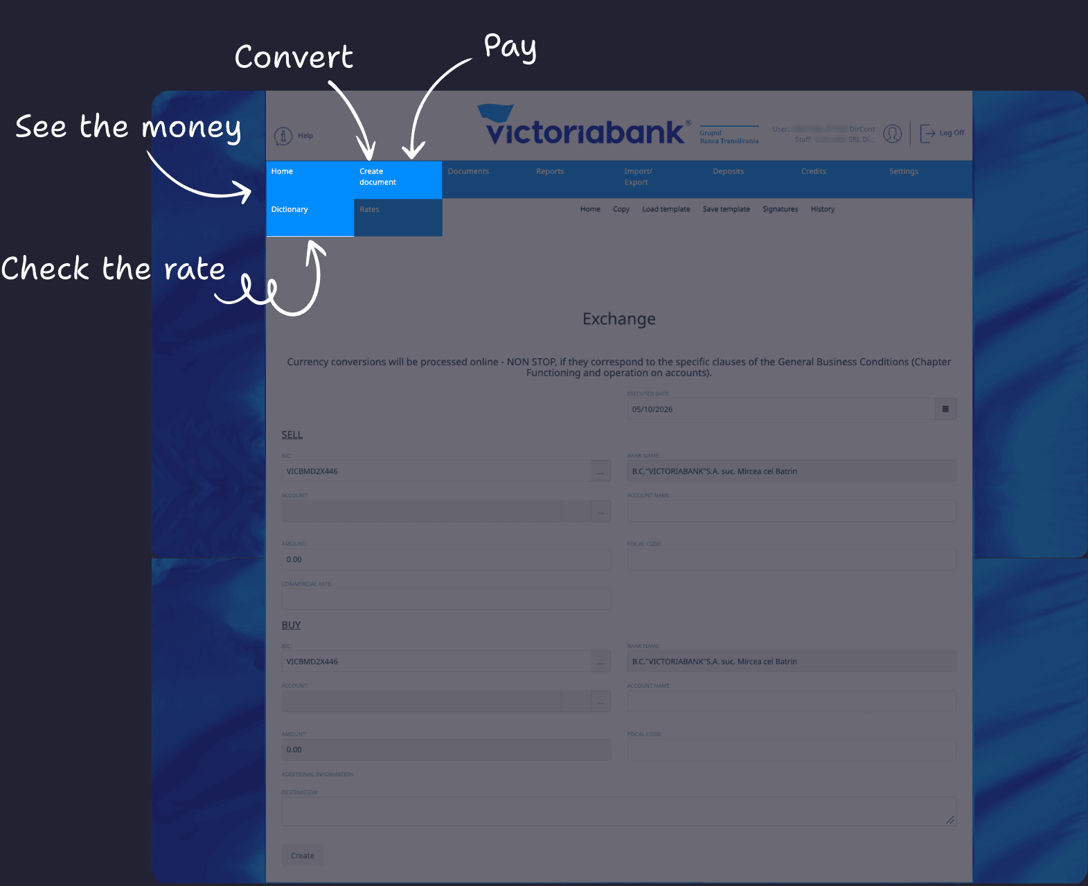
Audit. Now the client sees a 10-section desktop menu with 38 entries: some items repeat, names shift meaning across languages, and ten document folders never signal a change.
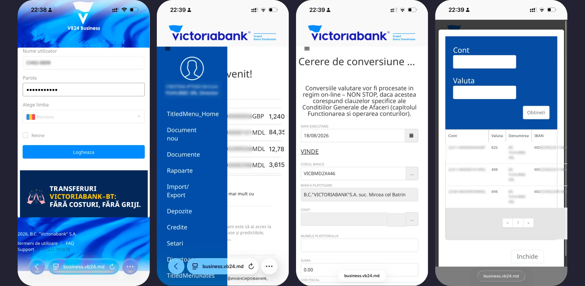
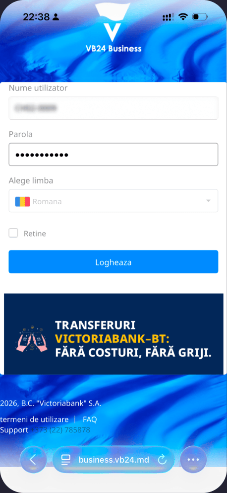
On mobile the platform layout falls apart: content is cut off, elements overlap, and tapping one thing triggers another.
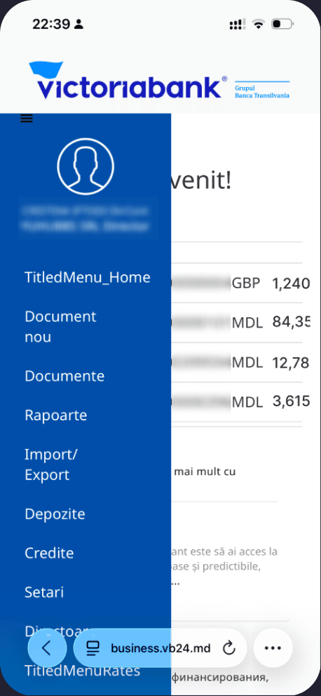
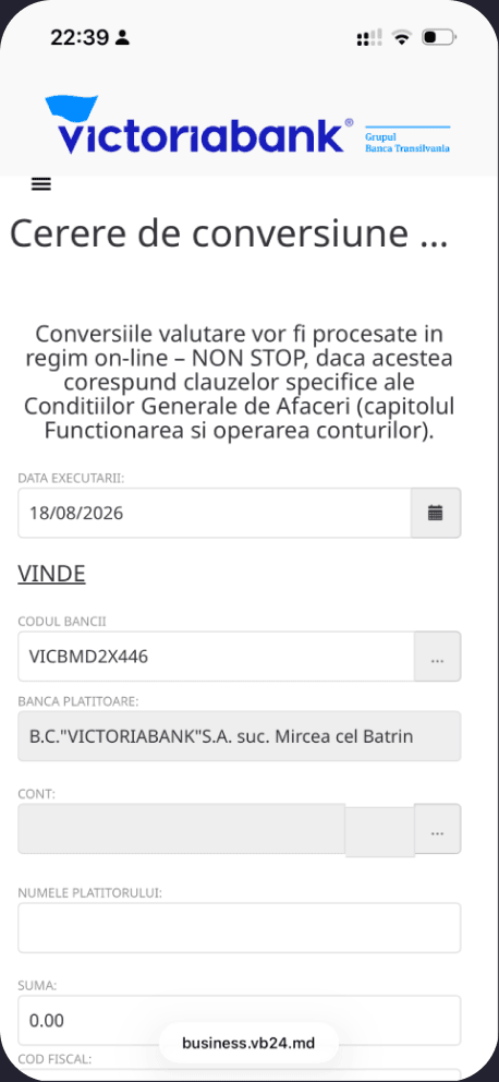
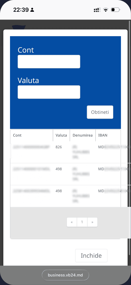
Hypotheses. Three things worth building, and what each one should change for the client
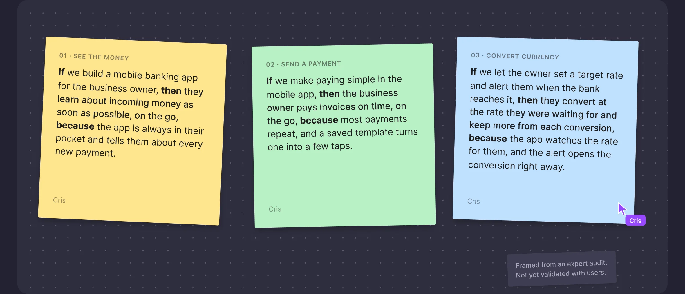
01 · SEE THE MONEY
If we build a mobile banking app for the business owner, then they learn about incoming money as soon as possible, on the go, because the app is always in their pocket and tells them about every new payment.
Cris
02 · SEND A PAYMENT
If we make paying simple in the mobile app, then the business owner pays invoices on time, on the go, because most payments repeat, and a saved template turns one into a few taps.
Cris
03 · CONVERT CURRENCY
If we let the owner set a target rate and alert them when the bank reaches it, then they convert at the rate they were waiting for and keep more from each conversion, because the app watches the rate for them, and the alert opens the conversion right away.
Cris
Framed from an expert audit.
Not yet validated with users.
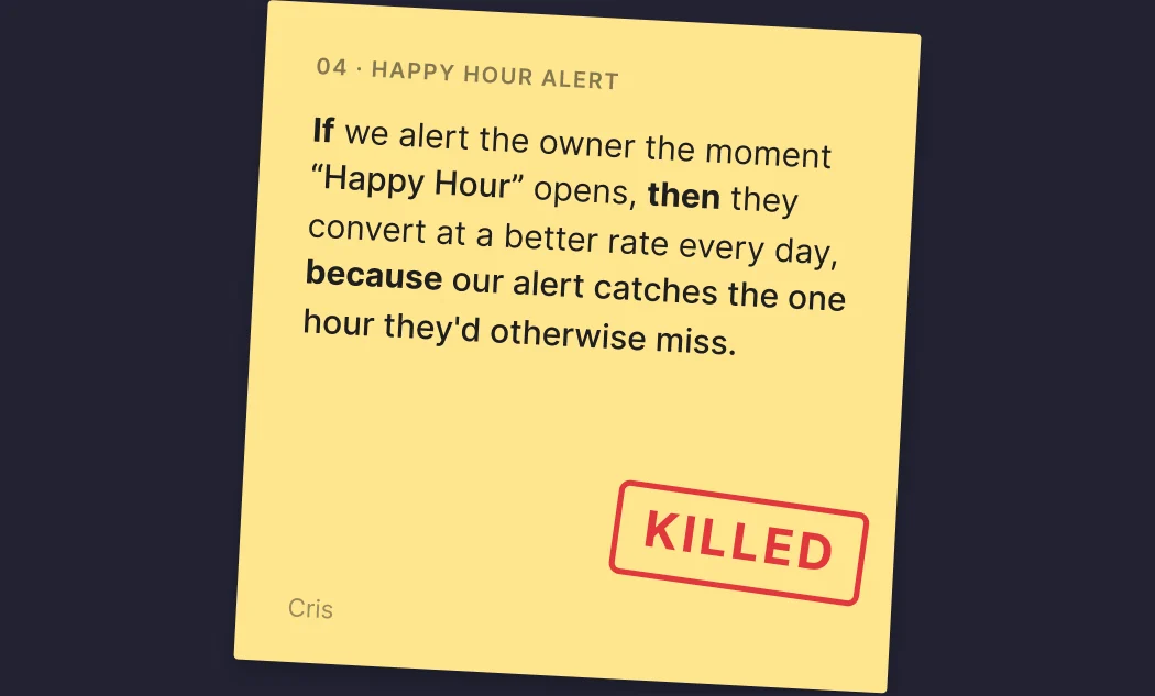
The idea I killed. Hunting the biggest client saving, I landed on the bank’s “Happy Hour.” — one hour a day at the better NBM rate, and an alert to never miss it. Then research showed the bank loses on it, so I let it go.
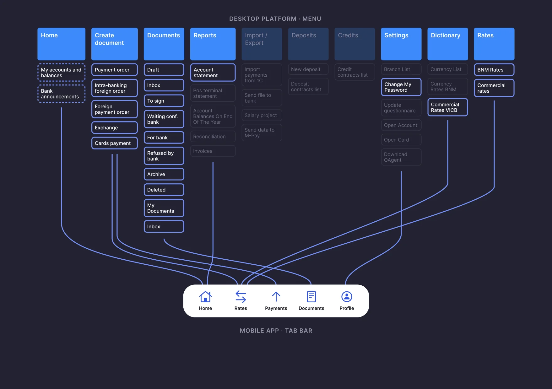
Decision. I moved 20 of 38 menu items into 5 tabs on mobile: the ones a business owner needs on the go. The other 18 stay on desktop.
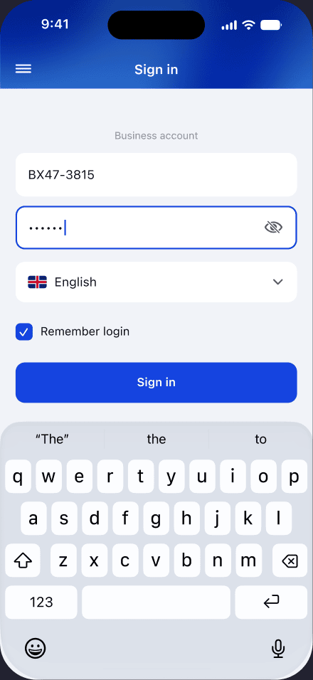
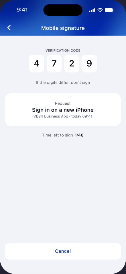
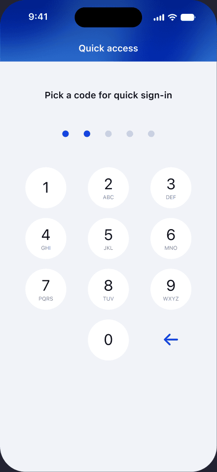
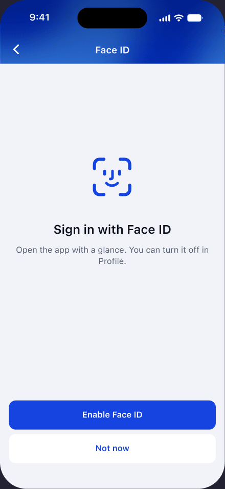
Same bank, faster door. Everything the desktop asks for happens on the first launch only. Every next visit is Face ID or a quick code.
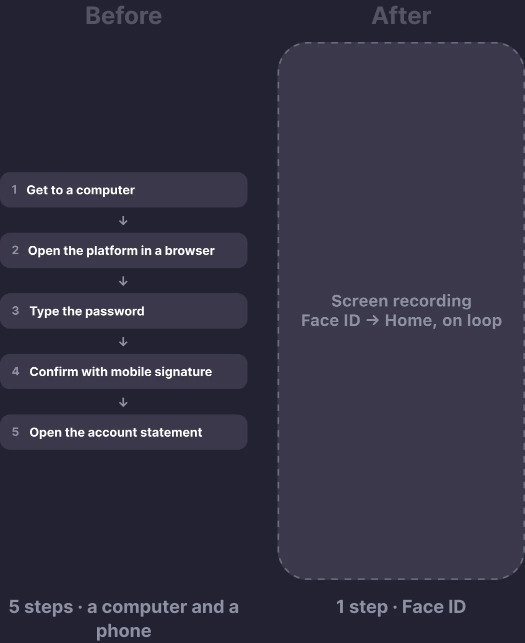
Before
1
Get to a computer
2
Open the platform in a browser
3
Type the password
4
Confirm with mobile signature
5
Open the account statement
5 steps · a computer and a phone
After
Face ID → Home, on loop
1 step · Face ID
First launch. Login, signature, quick code, Face ID. Done once, never again.
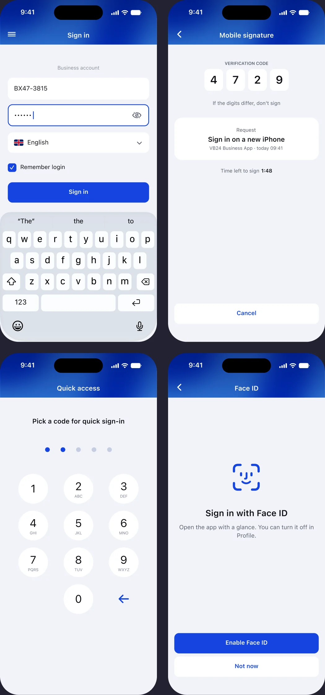
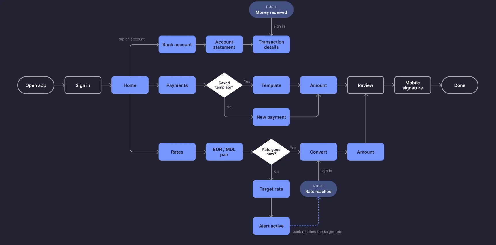
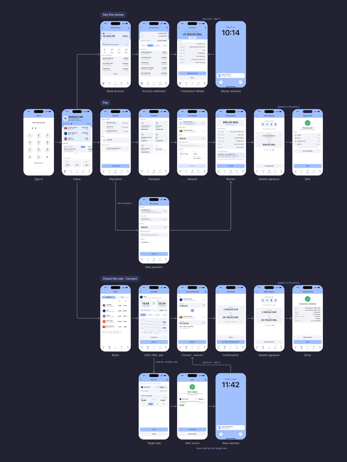
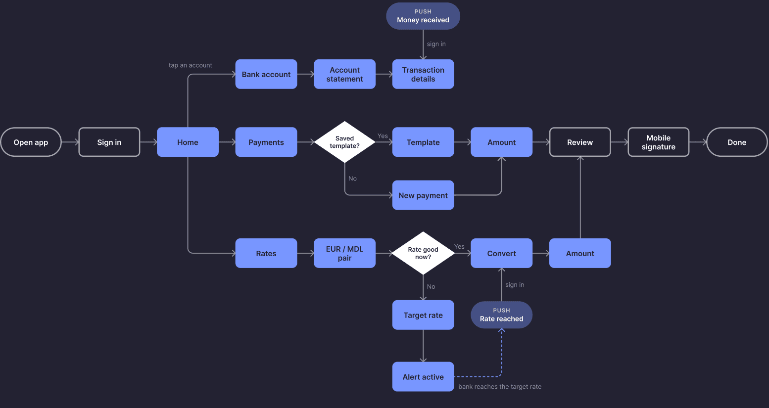
User flow. 4 actions start from Home, and the two that move money end with mobile signature.
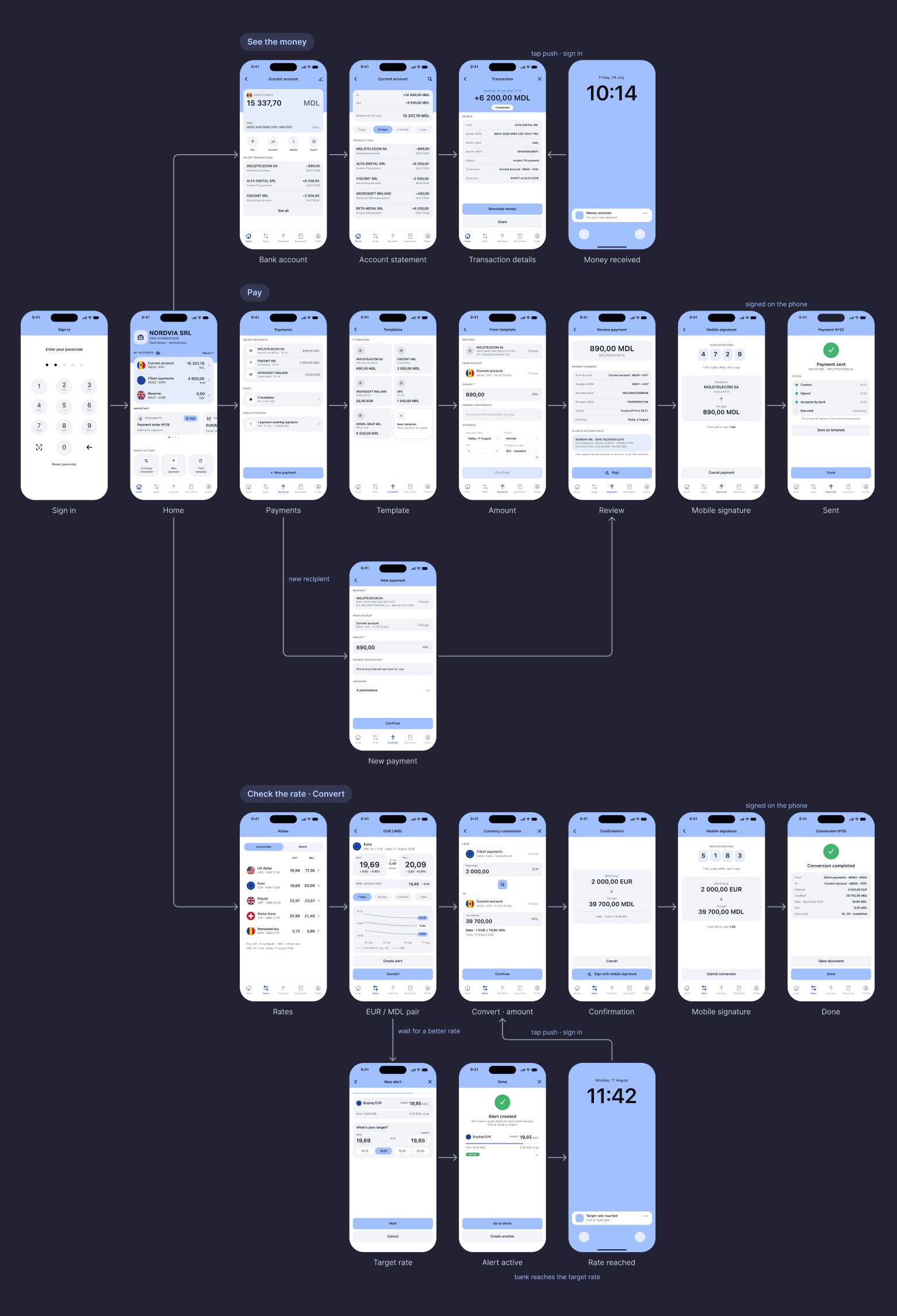
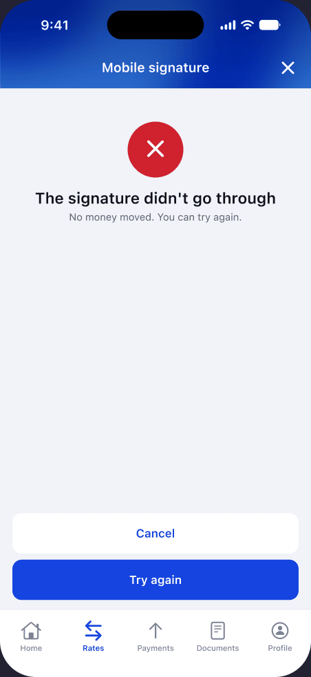
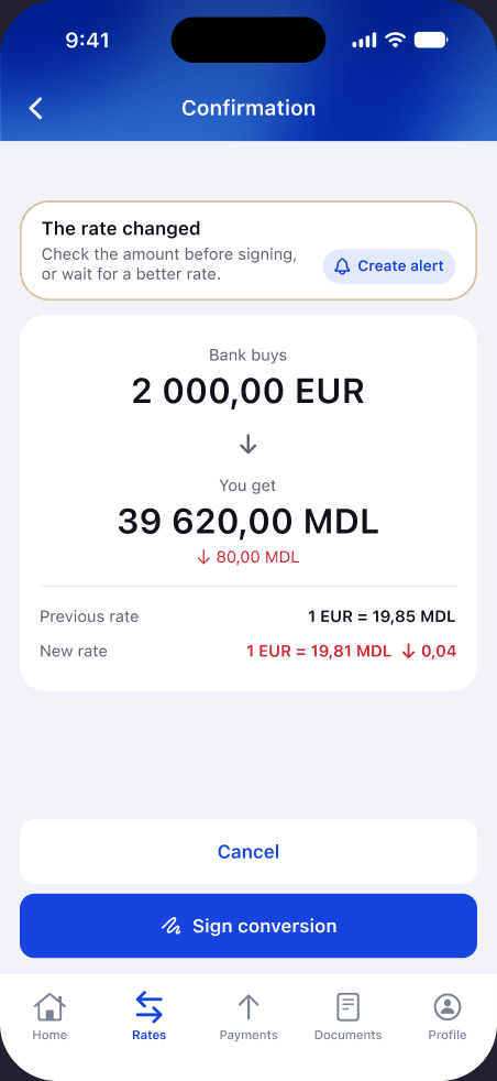
Edge cases. Every failed step tells the owner what to do next. Empty statement, statement load error - in Backlog.
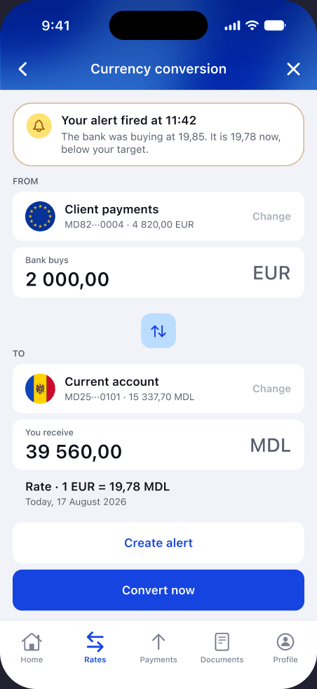
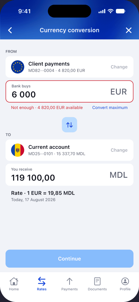
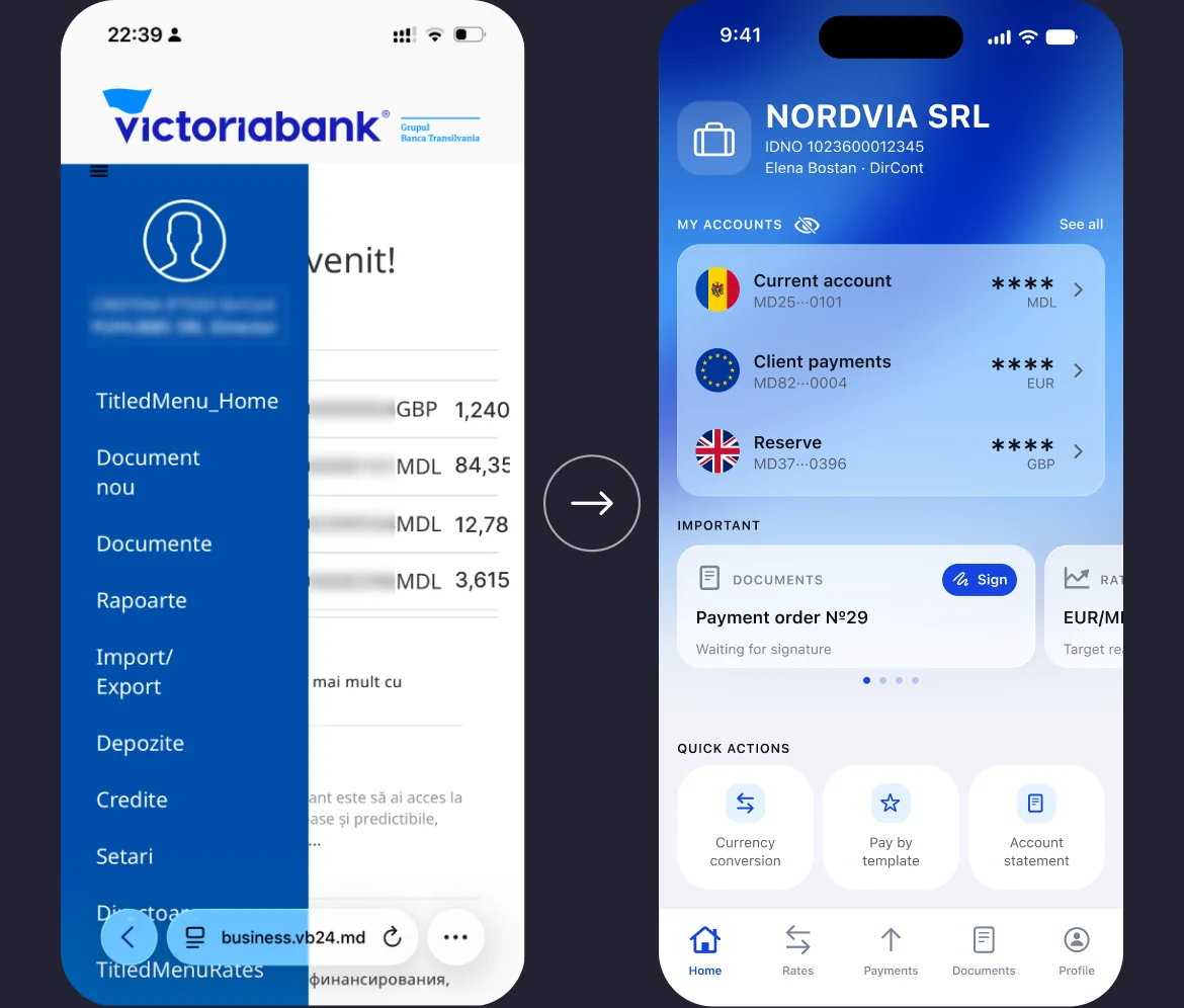
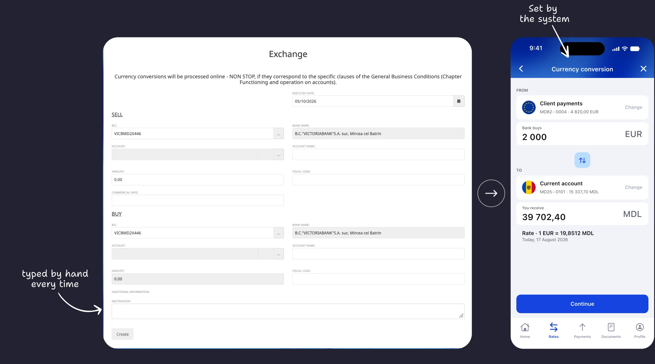
Before and after. The web platform hides the essentials behind a menu and drowns the exchange in noise. The app shows the important things first and nothing more.
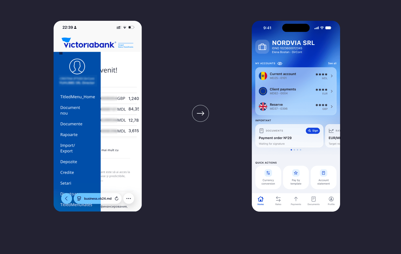
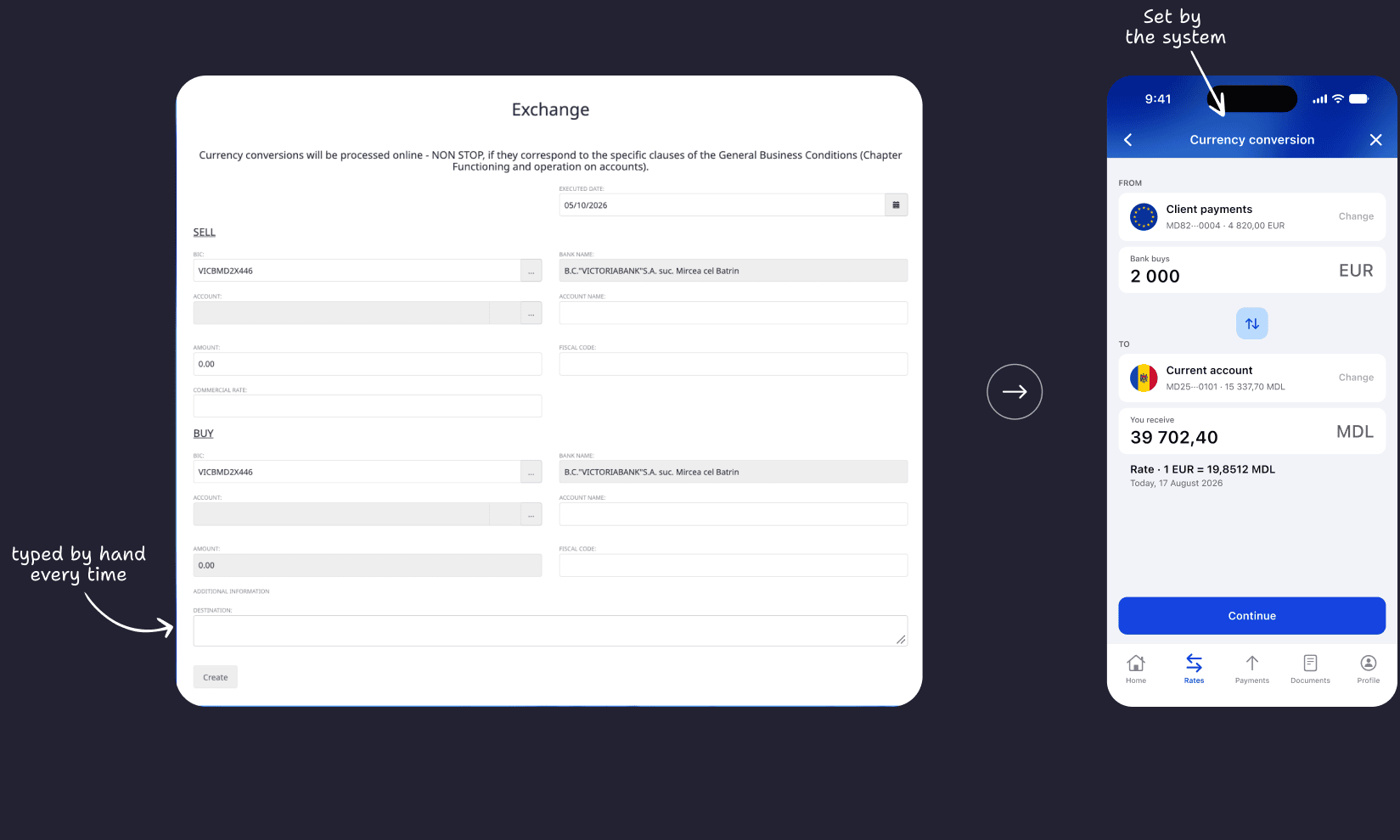
Alerts. The app comes to the owner: when money arrives, and when the rate reaches the target.
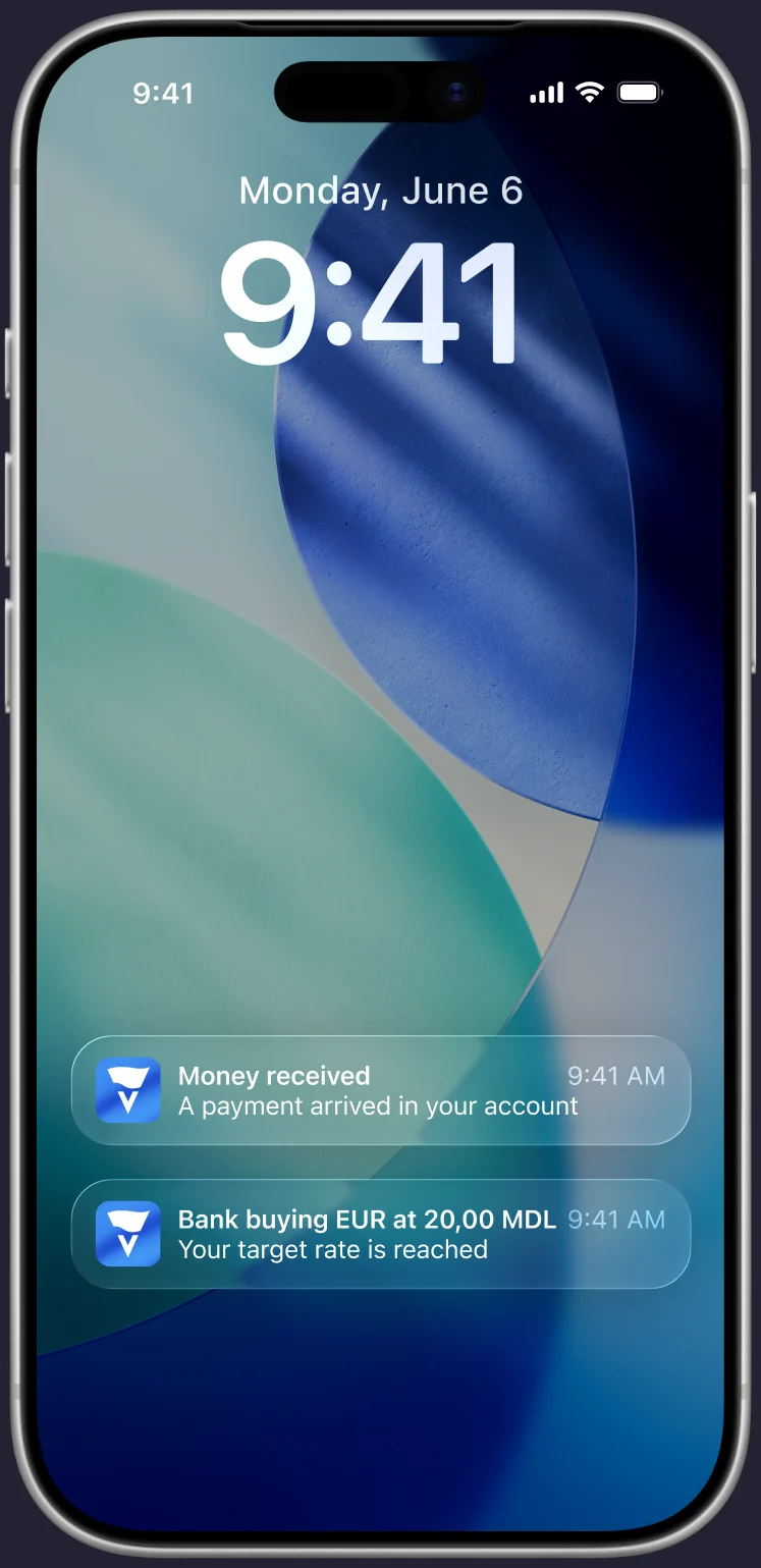
See the money
A push the moment money arrives. No amount on the lock screen.
Convert
A push when the bank reaches the target rate. One tap opens the conversion.
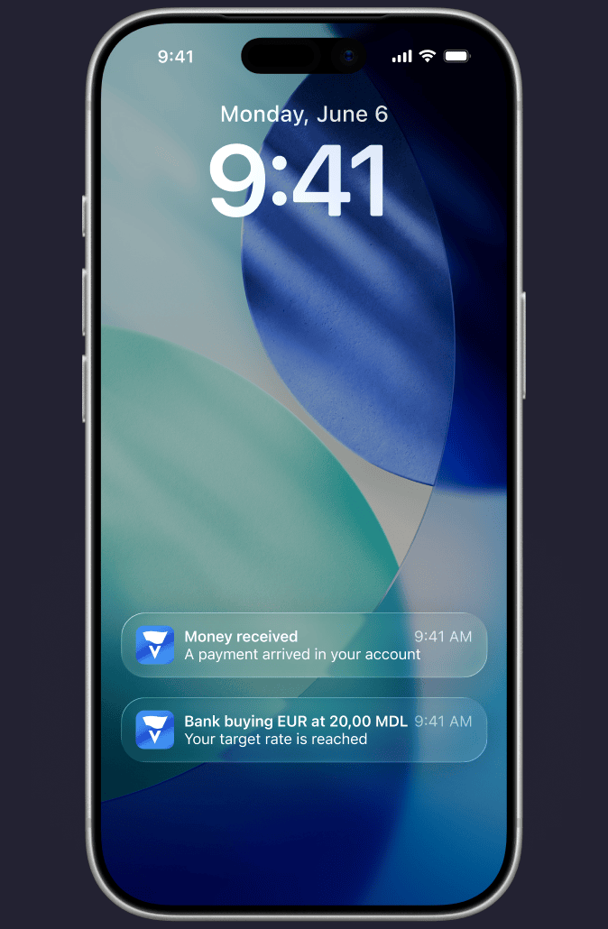
See the money
A push the moment money arrives. No amount on the lock screen.
Convert
A push when the bank reaches the target rate. One tap opens the conversion.
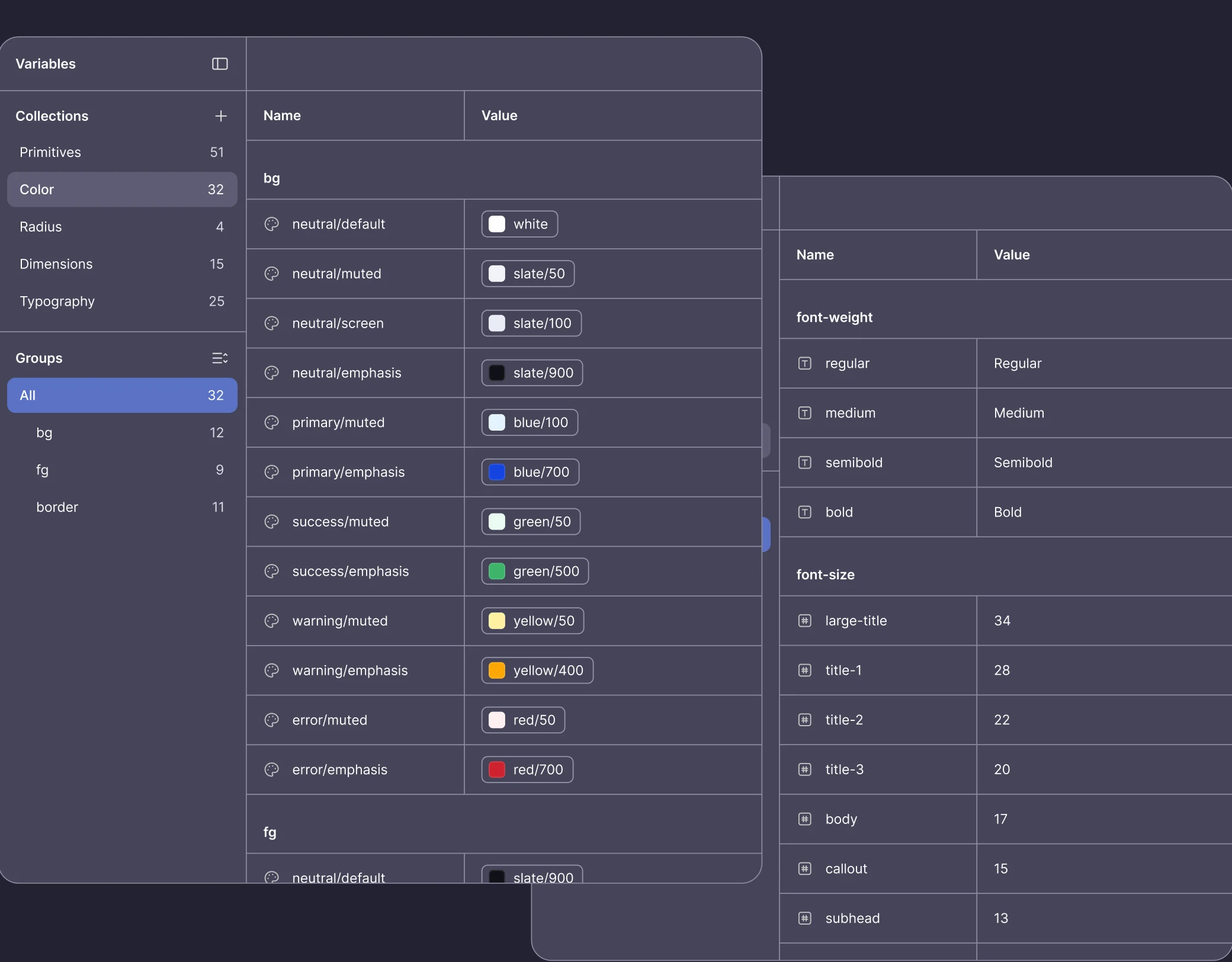
Tokens first. Color, type, spacing and radii all live as Figma variables.
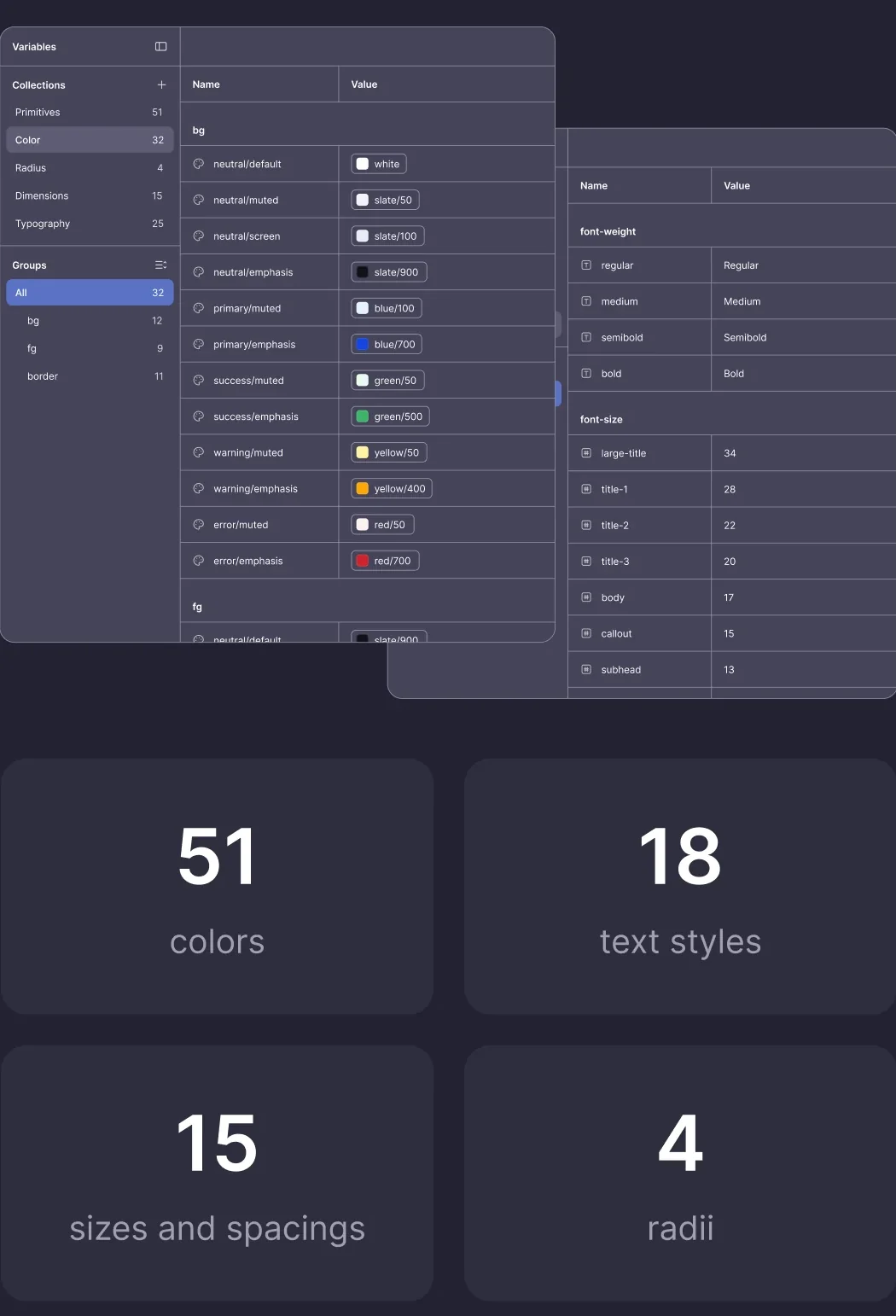
51
colors
18
text styles
15
sizes and spacings
4
radii